The ” MOSI ” Brand
Interview with Kinkani Grâce, Marketing Manager at MOSI Consulting.
1) RK Solutions becomes MOSI Consulting, Why?
It was time for us to change and assert our identity in a way that was unique in the market in order to facilitate our development.
This name change marks the beginning of a new era for the company..

MOSI means “ONE” in Kikongo, a Bantu language from Central Africa.
Literally in French, Mosi Consulting would translate as “Un Conseil”.
The number “UN” has many virtues because it represents unity and uniqueness.
With this figure, we want to enhance the unique relationships we have with our customers and employees.
MOSI is a unique ensemble and it is thanks to the harmony of this ensemble that we succeed in constantly improving and offering excellent performances.
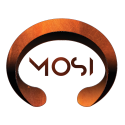
3) What does your Logo represent?
MOSI’s visual identity represents a copper bracelet, which is why our logo has this rounded shape, open at the ends.
Centuries ago, “Jonga” bracelets, made of copper, were used as bargaining chips in Central Africa, for large commercial transactions or as dowry.
In our logo, the Jonga bracelet represents our presence in the financial sector.
Brown and orange are the closest colours to copper.
In addition, brown symbolises strength, solidity and reliability, while the colour orange symbolises creativity, dynamism and communication.
Values that we strive to apply every day to our customers.
In concrete terms, MOSI is the logical continuation of RK Solutions.
4) What will MOSI’s positioning be in the coming years?
We are very ambitious but we will have to be very tenacious.
Our priority is to work on a long-term basis with each employee, and then, in a second phase, become, in the medium or long term, a reference in Luxembourg in the field of consulting for banks and insurance companies.
Credits
We would like to thank our partners.
Logo design : Serge Kalonda – Usio Concept.
Flipbook : Edouard Dula – Behance.